

A trading strategy can seem profitable for months.
However, it might fail when real market challenges occur if it is not carefully evaluated.
That is why trading KPIs matter so much: they reveal whether a system has skill behind it, or just a lucky stretch.
Many traders only focus on net profit and do not go beyond that.
That misses the real story, because trading performance metrics like drawdown, expectancy, win rate, and profit factor often tell a very different truth.
A system with a high win rate can still lose money if the average loss is too high.
A trader who keeps increasing their position size after a few good trades might confuse short-term luck with a solid advantage.
This mistake can lead to costly errors quickly.
To evaluate trading strategy performance properly, the numbers need context.
Spread, slippage, position sizing, and the shape of the equity curve all matter, especially in volatile markets where one bad week can erase a month of progress.
When the right metrics are tracked together, the picture becomes much clearer.
A strategy is no longer “good” because it feels good; it is good because the evidence holds up under stress.
When evaluating KPIs for trading strategies, it’s essential to move beyond net profit as the sole metric. While profit might be what we chase, the quality behind those profits is equally vital. Focus on key indicators like win rate, drawdown, and profit factor. For example, two strategies might show the same profit percentage, but one could carry much more risk than the other. Such nuances in data should not be overlooked. A practical approach involves understanding the context behind the numbers. Analyze how these KPIs reflect the real-world application, particularly under varying market pressures. This clarity can be derived through consistently tracking these metrics over different time frames and market conditions. To judge the effectiveness of a trading strategy, it’s imperative to adopt a comprehensive perspective that extends beyond surface-level profitability. Each metric has its own story that contributes to understanding overall strategy health. For example: Win rate indicates success frequency but is only meaningful in relation to the underlying capital at risk. Profit factor reveals the relationship between gross earnings and losses, while expectancy signals whether the strategy can deliver consistent returns over time. By intertwining these metrics, traders can ideally capture a holistic view of their strategy and avoid common pitfalls of over-reliance on isolated data points.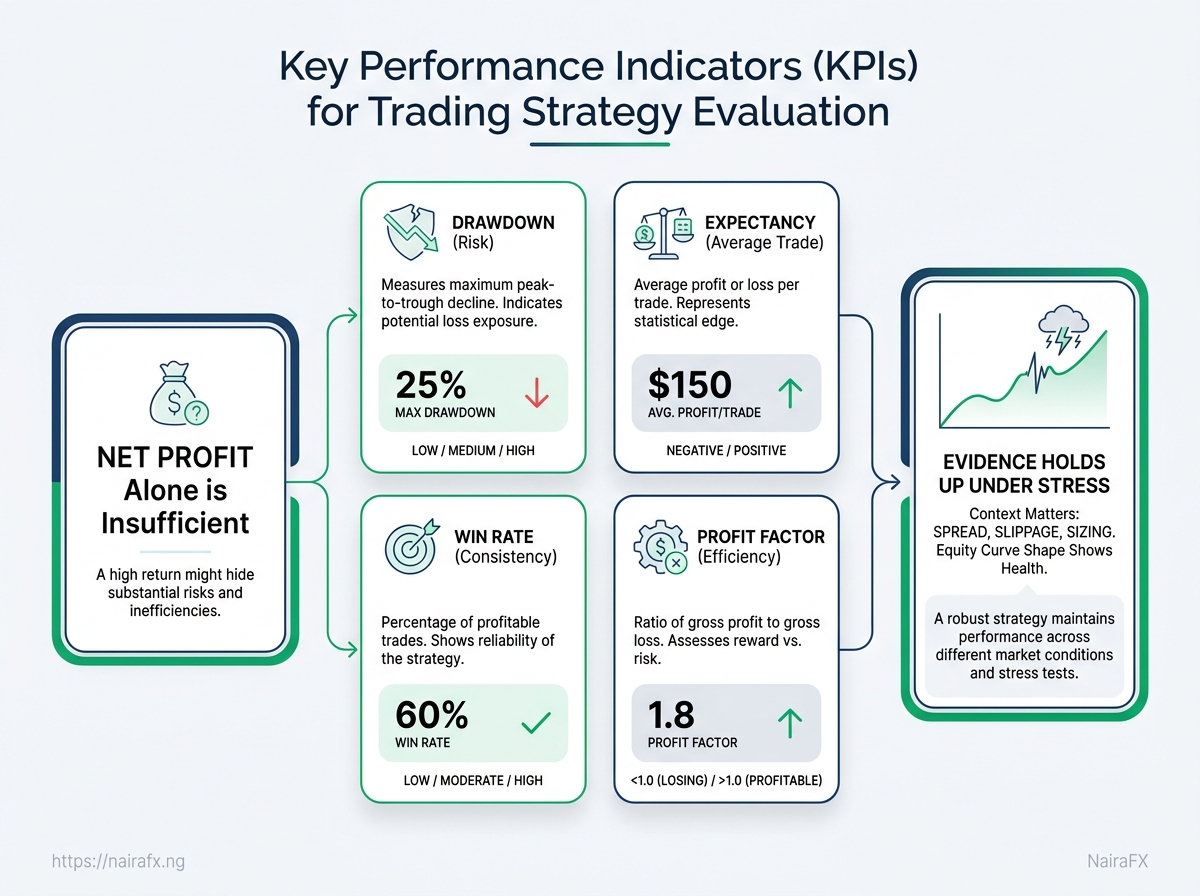
How do we judge whether a strategy is actually healthy over time?
Can one strong month prove a strategy works? >
How do we judge whether a strategy is actually healthy over time?
Can one strong month prove a strategy works?
How do we judge whether a strategy is actually healthy over time?
Can one strong month prove a strategy works? Not really.
A healthy trading strategy needs to be viable for more than just one lucky period.
One strong month could come from a clear trend, a news event, or simply random chance.
That’s why experienced traders look for patterns in trading KPIs rather than relying on one lucky streak.
The better test is whether the results behave like a system, not a surprise.
When you evaluate a trading strategy, you want to see consistency across market conditions, not just one flattering stretch on the equity curve.
A strategy that continues to perform in different environments may be easier to trust.
One that only looks good after a perfect run often breaks the moment conditions change.
Month-to-month behavior stays believable.
A healthy strategy does not rely on one huge outlier to look good.
Wins and losses follow a repeatable pattern.
The trade mix should feel consistent, not random from one period to the next.
Results hold up in different market moods.
A strategy that only works in one type of market is fragile.
Drawdowns recover in a reasonable way.
Sharp losses are not always a problem, but endless recovery time is.
Trade quality matches the rules.
Entries, exits, and sizing should behave the same way when you review them later.
The equity curve looks steady, not jagged.
Smoothness matters because extreme swings often signal hidden risk.
Performance still makes sense after costs.
A strategy that depends on perfect fills or tiny spreads is less durable than it first appears.
A good habit is to review performance in rolling windows instead of fixed snapshots.
That means checking how the system behaved over recent periods, then comparing it with older ones, so you can spot drift before it becomes painful.
One practical example: a breakout system may look excellent during a trending month, then go flat when price chops sideways.
That does not automatically make it bad, but it does mean the edge is regime-dependent and needs closer monitoring.
Healthy strategies tend to look a little boring.
They do not need perfect months to earn trust; they need repeatable behavior that survives ordinary market noise.
> **Key Takeaway:** >What mistakes distort trading strategy evaluation?
Why do some traders celebrate a strategy that later falls apart? >
What mistakes distort trading strategy evaluation?
Why do some traders celebrate a strategy that later falls apart?
What mistakes distort trading strategy evaluation?
Why do some traders celebrate a strategy only to watch it crumble? Most often, it’s not the market that’s at fault.
It is the way the strategy got judged in the first place.
A high win rate can look comforting and still hide weak economics.
A strategy that wins often but has big losses can be worse than one that wins less often but has higher payoffs.
That mistake shows up a lot when traders evaluate trading strategy results by emotion instead of process.
One losing week feels “bad,” so the rules change.
One hot streak feels “proof,” so the plan gets praise it has not earned.
A simple example makes it clear.
Research from industry experts suggests that a system that wins 78% of the time may sound excellent, but it is important to consider the average loss in relation to the average gain.
In that case, the account can still drift lower even while the trade log looks impressive.
Do judge the payoff structure: Compare average win, average loss, and
expectancytogether, not in isolation.Don’t chase a high win rate: A frequent-winner strategy can still be fragile if losses are too large.
Do review enough trades: Small samples make trading performance metrics look better or worse than they really are.
Don’t change rules after a bad stretch: Emotional edits usually damage the original edge.
Do ask what the strategy earns per risk unit: That keeps the focus on quality, not just noise.
Don’t confuse comfort with strength: A smooth equity curve can still hide poor risk control.
The disciplined way to use trading KPIs is boring, and that is a good sign.
It means the numbers are doing the talking, not the mood of the day.
A useful habit is to write the evaluation rules before the test begins.
Then the result is measured against fixed standards, not against hope, fear, or last week’s trades.
> **Key Takeaway:**How do we turn KPI readings into better trading decisions?
Why do some strategies look brilliant in backtesting and then stumble the moment real money is on the line?
How do we turn KPI readings into better trading decisions?
Why do some strategies look brilliant in backtesting and then stumble the moment real money is on the line? Typically, the issue is not with the idea itself.
It is the gap between what the system expected and what the market actually delivered.
A clean way to evaluate trading strategy performance is to separate signal quality, execution quality, and risk behavior.
If the backtest was strong but live trading slips, the KPI readings should tell us where the break started.
When backtests and live trades disagree
A strategy can have a solid expectancy in testing and still underperform live because of spread widening, slippage, slow fills, or a market regime that changed after the test period.
That does not always mean the strategy is broken.
It often means one layer of the process needs attention.
Imagine a breakout system that showed a healthy win rate in backtests, but live trades keep entering after the move has already started.
In that case, the problem is not the setup logic alone.
The KPI trail may point to execution delay, worse average entry, or a drop in reward-to-risk after costs.
Check these readings first:
Average trade cost: Compare live costs against backtest assumptions.
Entry quality: See whether fills are consistently worse than planned.
Edge decay: Watch whether expectancy falls only in live trades.
Drawdown shape: Notice whether losses cluster faster than before.
Market context: Ask whether the live period had tighter ranges, news shocks, or weaker trends.
A simple weekly review loop
A weekly review works best when it stays short and repetitive.
The goal is not to rethink the whole system every Friday.
It is to spot a real pattern before emotions take over.
Export the week’s trades.
Split them into winners, losers, and scratch trades.
Compare live results to plan.
Look at planned entry, actual entry, stop size, and exit quality.
Score the main KPIs.
Track expectancy, average R multiple, win rate, and max adverse move.
Tag each trade.
Mark whether the trade followed the setup, execution, and risk rules.
Decide one action.
Continue, reduce size, or pause until the next sample is clear.
A useful rule: if the setup is intact but execution is weak, fix the process.
If both the setup and the live KPI pattern have shifted, pause and retest before adding more size.
That kind of weekly discipline keeps trading performance metrics tied to action, not guesswork.
Over time, the habit turns noisy data into cleaner decisions.
Conclusion
Reading the Curve, Not Just the Payout
Remember this key point: a strategy is only as strong as the evidence that supports it.
Strong trading KPIs do more than confirm profits; they show whether those profits came from repeatable skill, controlled risk, and a plan that can survive a rough month.
A steady equity curve with modest returns often shows a more reliable strategy than a sudden spike in gains followed by large losses.
This is why trading performance metrics are crucial when you assess a strategy.
A system that looked healthy on paper can unravel once losses cluster, position sizes drift, or the average loss quietly grows faster than the average win.
The real test is not whether the strategy won before, but whether it still behaves well when conditions stop being friendly.
Start with three numbers today: win rate, average reward-to-risk, and maximum drawdown from your last 20 to 30 trades.
Compare them to the story your equity curve is telling, and watch for any mismatch between profit and stability.
If you want a second set of eyes on that process, our risk management and equity-curve review work can help make the picture much clearer.
What are the most important KPIs for evaluating a trading strategy?
The key trading KPIs should go beyond net profit.
They should check if the advantage is real, repeatable, and sustainable.
Use maximum drawdown, expectancy, win rate, and profit factor to capture trade quality and the economics of wins versus losses.
This prevents a strategy from looking “great” during a lucky stretch yet failing under real market pressure.
Which trading performance metrics should I track to measure strategy effectiveness?
Track trading performance metrics that describe both results and quality of the trade distribution, not just headline returns.
Win rate shows how often trades are profitable, profit factor compares gross profits to gross losses, and expectancy measures the average outcome per trade over time.
Maximum drawdown and the equity curve shape are also critical to confirm the strategy can withstand adverse periods.
How do you evaluate trading KPIs like win rate, payoff ratio, and drawdown?
Evaluate win rate in context: a high win rate can still lose money if losses are larger, so you must pair it with profit factor and expectancy.
Payoff ratio (wins versus losses) is captured by how gross profits compare to gross losses and by the average per-trade outcome.
For drawdown, focus on maximum drawdown and how quickly the equity curve recovers, since a strategy that drops sharply can be fragile.
What KPIs indicate risk in a trading strategy, and how should they be interpreted?
Maximum drawdown is the clearest risk KPI because it shows how bad losses can get before recovery.
Drawdown duration and the equity curve’s behavior matter too: a system that only looks good during calm periods is likely not durable when real pressure arrives.
Even with decent win rate, weak payoff economics can create hidden risk that emerges during occasional losing streaks.
How can I compare two trading strategies using consistent trading performance metrics?
Compare two strategies using the same KPI set—win rate, profit factor, expectancy, and maximum drawdown—so results reflect trade quality rather than just returns.
Also make the comparison realistic by adjusting for spread and slippage, and examine equity curve shape and drawdown duration rather than a single favorable month.
Two strategies can both be up 8%, yet be fundamentally different in fragility and survivability.